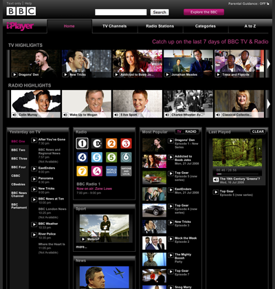
see what your looking to get at ? way too many bright points drawing and confusing the eye, who could not tell that, when they were testing this, that it was way to busy ? Mixing in radio confuses the issue especially by giving radio tag pictures that make it look like video content apart fom an icon which doesnt draw the eye, preferences about tv / radio should quite obviously be remembered between session visits, Whichever way, it now takes me about three times longer to find and watch what i want with this interface. And the way the structural titles are dimmer than everything else ? greyed out just wrong, By why give advice when your not paid to consult, and some other egit is probably making a good living out of ballsing it up.
NeuralMap
Where my mind is wont to probe and rant about

