Today we seem to be getting an awful lot of film that is artificially coloured or badly restored, and then the people who had this task, then fail to admit to such issues, and claim it as some clever part of the artistic process, for instance the bladerunner restoration was very good but the colour correction for film stock aging was done pretty badly.
here is a snapshot from an opening scene in bladerunner, the greenish looking areas, are the colour of the film as released, the normal areas are how I have colour corrected it through restoration, whos aim was to return the footage to a realistic colour scenario.
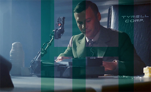
Now obviously you might land somewhere between the two for style or effect purposes, but surely not to that level of green the film was released in. Final Cut … ? I hope not ! at least one more please where the utmost has been done from the restoration point of view. Admiteadly this was done for just one frame using photoshop, but you could apply the photoshop techniques above, using a rendering farm style methodology, pushed through photoshop actions to restore an entire film to this kind of quality a cut at a time, if the green above is the best video based tools can do, then I suggest the restorers start building a new equipment base because they are not succeeding here ?
Now let me state the blade runner restoration in all other aspects is a damn good job, and the film is a work of art. Which is preciseley why it needs restoration equivalent to being a great work of art.
On to another issue but related, colour and contrast style-lisation of modern films, films that piss me off with the ridiciculous colour grading, the latest harry potter film for instance doesn’t seem to have been improved, by the ludicrous desaturation and bleached over contrast hatchett job the directors colour guy “BRUNO” did on the film. Ive tried to colour correct this snap, again the blue areas are the colourisation of the film as released, taken from a trailer on apples movie trailer site, but to be honest the colourist so bleached the film of colour its almost impossible, again the cyan tint on the film is pretty heavy.
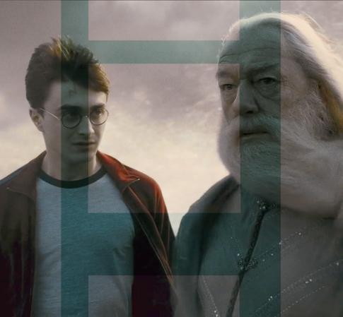
The true measure of how out this is, should be taken from an RGB measurement of harrys grey tshirt which should have roughly equal RGB values, if you presume its supposed to be grey.
it reads :
r: 45
g: 77
b: 81
now it doesnt take a genius to realise, however my monitor is calibrated (personally I think pretty damn well) those RGB values are going to yield an extremely blue green cast to the image.
they must all be using the same equipment that is poorly calibrated or something ? Or perhaps theyve all read the same book that explains how colour tinting can be used to set emotional mood within a target audience or something, whichever way they always go to far. DumbleDores forehead is the next measuremet and both these measurements are 11 by 11 pixel averaged.
r: 68
g: 80
b: 75
To get a realistic skin colour for harry potter you would have a set of descending rgb values like this r: 191 , g: 140, b: 108 taken from a photo on the web.
I guess some of these colour grading issues can come about because the eye is extremely adaptive, so if your watching a full frame film where the colour grading has been blued so heavily, they eye will naturally recalibrate the blueness in your brain to be less blue and less obvious. But the truth as shown by the images above where sections of both image colourisations sit side by side cant be ignored. RGB values can lie a little due to calibrational differences but they cannot lie to the extent of being proportionally that different from real life.
This is allot like making music to cater for the rubbish sound systems people have today but in the invverse, these films are obviously being made with equipment that is radically poorly calibrated or skewed, or … were all viewing them on devices that are radically calibrated or skewed whichever way these issues need to be resolved, and colourisation needs to stop being used as a way, to make rubbish films look better because it doesnt work. Also if as a director you get martered by your own style cliches by employing the same colourist, you use for a psycho thriller for a childrens movie just because hes your mate or something, you need to get a grip and control you own noise making idiocy.
I guess this is a problem really with being a director, You have to have a pretty big ego, to get a film made in the first place, christ there’s enough barriers in your way to prevent you, and if your not adamant in your vision then the film will turn out pretty awfull, insistance on things can be very important, but then on the other hand not being prepared to take on board when something is plainly disfiguring your film is also a mistake.
Great and aging Directors should by law have a young assistant travelling with them at all times, whos eyes have been tested for quality, to make sure they can tell when a shot is in focus (james cameron terminator comes to mind) or when the colour of the film is correct. Maybe someone will invent a way of calibrating to real life automatically, but seriously the human eye is the only usefully objective measure.
Truth Colour grading was invented to match film together that was shot on different stock, and to make films look old artificially, The problem is now people are using colour grading as a creative tool to change the entire appearance of a film for supposedly artistic reasons when most of the time, Like any computer tool they dont understand when to, or better still not to … use it, and get carried away thinking well its there i’ll use it, or its my job as a colourist, so I’ll egotistically show my moneys worth of talent because im insecure, by having a drastic impact on the film artistically when a light touch would suffice three times better.
aleisha as long as your assignment doesnt consist of copying stuff wholesale from my blog ? your welcome.
is this you ?
http://www.facebook.com/profile.php?id=100002619973224
this was very helpful to the assignment i am now completing in media, thankyou :)
Pingback: Why Colour Grading In Film is Important | Adobe Tutorials